Direct answer: Painted signs and typographic murals work when the message reads instantly: high contrast, clear letterforms, correct spacing, and placement at the real viewing distance.
Quick takeaways
- Legibility is design + distance, not just “nice lettering.”
- Contrast and spacing matter more than fancy effects.
- Test-read the layout from the hallway/street before committing.
- Plan for maintenance: scuffs, cleaning, sun, and glare.
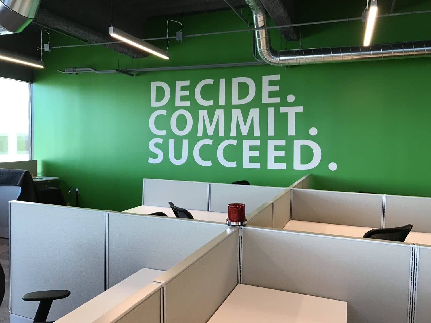
Sometimes all you need is a simple bit of text to enhance your workplace.
This project uses custom wall vinyl and paint.
We recommend a 2-step system, the first being a permanent isolation coat, followed by GOLDEN MSA Varnish, a removable varnish.
— GOLDEN Artist Colors, Painting Exterior Murals, Source
Project checklist
- Message defined (short + memorable)
- Font/lettering style chosen for distance
- Contrast checked in real lighting
- Spacing and alignment guides marked
- Edge/outline strategy defined (for clarity)
FAQ
How do you choose a readable font for a wall sign?
Pick a simple style with open counters and strong contrast. Avoid ultra-thin strokes if the wall has texture or glare.
Do painted signs need sealing?
If they’re high-touch, outdoors, or in industrial environments, a compatible protective finish can help with cleaning and durability.
Want help with a mural in the Bay Area?
If you want a recommendation for your wall (surface prep, paint system, timeline), send photos and rough dimensions and we’ll help you scope it.
Related reads
- This Mural is over 170 feet by 10 feet That's a lot of paint
- Another Inchins Mural Is All Wrapped Up