Direct answer: A strong mural comes down to the same basics: solid surface prep, a clear layout plan, and a painting sequence that builds clean shapes before fine detail.
Quick takeaways
- Prep the wall like you mean it (clean, repair, prime).
- Transfer the design with a repeatable method (grid/projection).
- Block big shapes first; detail is the last pass.
- Protect the work when the environment demands it.
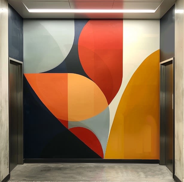
Ever see a mural that just... grabbed you? Made you stop in your tracks and stare? Chances are, it wasn't just the vibrant colors or the cool subject matter that caught your eye. Nope, it was probably something you didn't even notice: the negative space.
Wait, what's negative space?
Don't worry, it's not as complicated as it sounds. Negative space is just the empty areas around and between the main subjects in a piece of art. Think of it like the breathing room in a painting. Without it, everything would feel cramped and overwhelming – kind of like being stuck in a packed elevator, but for your eyes.
Why should you care about negative space?
Good question! Negative space is like the unsung hero of the art world. It's working behind the scenes to:
-
Give your eyes a break (because even your eyes need a vacation sometimes)
-
Make the important stuff stand out
-
Keep things from looking like a chaotic mess
Using Negative Space: Tips for the Aspiring Mural Artist
So, you're ready to paint the town red (or blue, or green – whatever floats your boat). Here's how to use negative space like a pro:
-
Plan it out: Before you even pick up a brush, sketch your ideas. Figure out where your main elements will go and where you'll let the wall breathe.
-
Find the balance: Too much negative space? Your mural might look unfinished. Too little? It'll be a visual overload. You're aiming for that Goldilocks zone – just right.
-
Play with contrast: Want to make something pop? Surround it with simplicity. It's like wearing a neon shirt to a black-tie event – it'll definitely stand out.
-
Guide the viewer: Use empty spaces to lead people's eyes through your mural. It's like creating a treasure map, but for eyeballs.
-
Embrace the emptiness: Remember, blank space isn't wasted space. Sometimes, less really is more.
Real-World Examples (Because Who Doesn't Love a Good Name-Drop?)
Ever heard of Banksy? Of course you have. This mysterious street art legend is a master of negative space. His simple stencils pack a punch because of all that empty space around them. It's like giving his message a spotlight in the urban jungle.
Or how about Diego Rivera? His murals are packed with detail, but he knew when to pump the brakes. He used negative space to make sure each element had its moment to shine.
Try This at Home!
Want to flex your negative space muscles? Here's a fun little exercise:
-
Grab a piece of paper and a pen (or raid your kid's crayon stash – we won't judge).
-
Draw a simple object – let's say a coffee mug (because who doesn't need more coffee?).
-
Instead of coloring in the mug, color everything around it.
-
Step back and look – see how the mug's shape emerges from the space around it? Magic!
Wrapping It Up
Using negative space in mural art is all about finding that sweet spot between busy and boring. It's a skill that takes practice, but it can turn a good mural into a showstopper. So next time you're planning your masterpiece, don't just focus on what you're painting – think about what you're not painting too. Trust me, your mural (and the people admiring it) will thank you.
Got Questions? We've Got Answers!
Q: Can negative space be any color?
A: Absolutely! It doesn't have to be white or plain. Go wild with colors or patterns if that's your jam. Just make sure it's not stealing the spotlight from your main elements.
Q: How do I know if I'm using enough negative space?
A: Step back and squint at your mural. If everything blurs together, you might need more negative space. If you can still make out the main shapes and forms, you're on the right track.
Q: Can negative space have texture?
A: For sure! Texture in negative space can add depth and interest to your mural. Just remember, it should complement, not compete with, your focal points.
Remember, creating great murals is a journey, not a destination. So have fun, experiment, and don't be afraid to embrace the power of empty space. Your walls (and your audience) will love you for it!
We recommend a 2-step system, the first being a permanent isolation coat, followed by GOLDEN MSA Varnish, a removable varnish.
— GOLDEN Artist Colors, Painting Exterior Murals, Source
Project checklist
- Surface cleaned + primed
- Layout method chosen
- Palette tested on wall
- Painting sequence planned
- Protection/maintenance plan set
FAQ
Can you paint a mural on any wall?
Most walls can work if they’re properly prepared and the paint system matches the surface. Moisture and flaking paint are the two biggest red flags.
How do you keep the design accurate at scale?
Use a grid or projection to transfer key anchors, then check proportions early before you commit to detail.
Want help with a mural in the Bay Area?
If you want a recommendation for your wall (surface prep, paint system, timeline), send photos and rough dimensions and we’ll help you scope it.
Related reads
- Create Neon-Style Signs: DIY Guide for Bay Area Sign-Makers
- Painting Shadows And Highlights In Murals Bringing Walls To Life