Direct answer: Font selection for painted signs and lettering murals is mostly about legibility at distance and fit for the medium. Choose a style that matches your brand, then test it at real scale so spacing, stroke weight, and contrast hold up on the wall.
Quick takeaways (font choice is a system)
- Start with viewing distance. The best font on a laptop can fail on a wall.
- Design for paint. Thin strokes and tiny counters disappear on textured surfaces.
- Spacing is everything. Kerning and line spacing matter more at large scale.
- Contrast beats cleverness. If it’s not readable, it’s not working.
- Mock it up at size. Print tests or tape outlines on the wall before you commit.
1) Pick the font based on where people will stand
Ask: is this meant to be read from across the street, from the sidewalk, or from across a room?
- Far distance: simpler letterforms, heavier weight, strong contrast.
- Close distance: you can add more personality and detail.
- Mixed distance: use hierarchy (big primary text, smaller secondary text).
2) Make the type “paintable”
Paint has physical limits. A font that looks clean digitally can become messy if:
- strokes are too thin for the brush/roller and wall texture
- counters (the inside of letters like “o” and “e”) are too small
- the layout doesn’t allow for clean edges
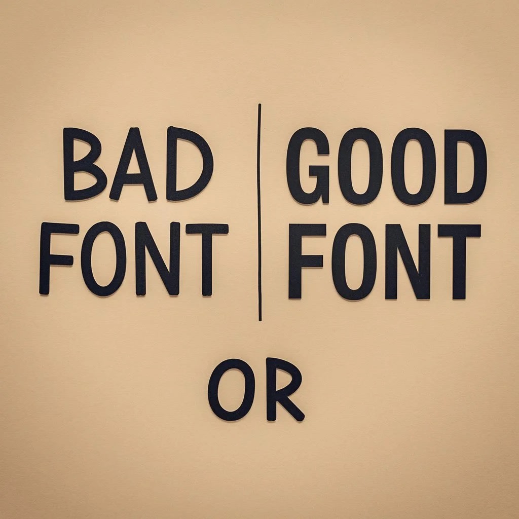
3) Contrast: the fastest way to improve legibility
If you want lettering to read, contrast is non‑negotiable. Accessibility standards for text also reflect this idea.
“The visual presentation of text and images of text has a contrast ratio of at least 4.5:1, except for the following:”
You don’t need to turn your wall into a compliance exercise—the takeaway is simpler: test your colors in the real lighting and make sure the words pop.
4) Kerning and layout at mural scale
Large lettering magnifies spacing mistakes. Common fixes:
- Manual kerning: adjust “awkward pairs” (like AV, WA, To).
- Optical balance: letters don’t “feel” the same width even if they measure the same.
- Line breaks: avoid orphan words and cramped last lines.
Font selection checklist (for signs + lettering murals)
- Primary message readable at the intended distance
- Stroke weight survives wall texture
- Counters stay open (don’t collapse)
- Spacing/kerning adjusted for large scale
- Color contrast tested in real lighting
- Mockup approved at near-real size
FAQ
Should I use a script font for a mural?
Sometimes—if the viewing distance is close enough and the strokes are thick enough to stay readable. Scripts can look beautiful, but thin lines can disappear on texture.
What’s the most common lettering mistake?
Not testing at real scale. A quick print or taped outline on the wall catches most problems early.
Want painted lettering or a type-forward mural in the Bay Area?
Send wall photos and the message you want to include. We’ll recommend a lettering approach that reads cleanly at the real viewing distance.
Commercial murals → · See finished murals →